Bar Brother
Good eggs only—brand identity for an expat pub in Amsterdam
- Client
- Bar Brother
- Location
- Amsterdam, Netherlands
- Services
- Art Direction
- Brand Identity
- Animation
- Marketing
- Year
- 2022
- Credits
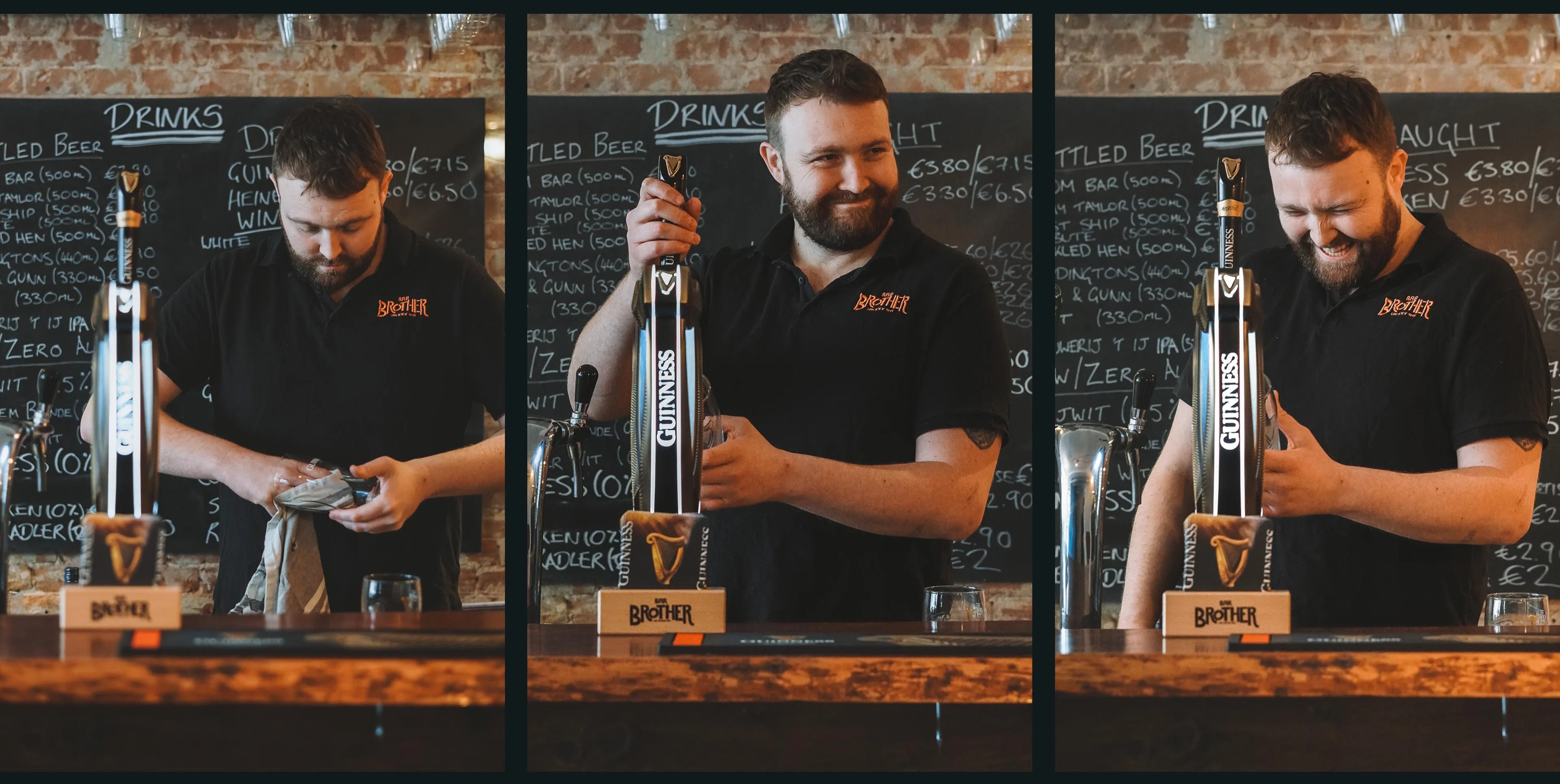
- Emiel Unknown: Photography
About the project
The story
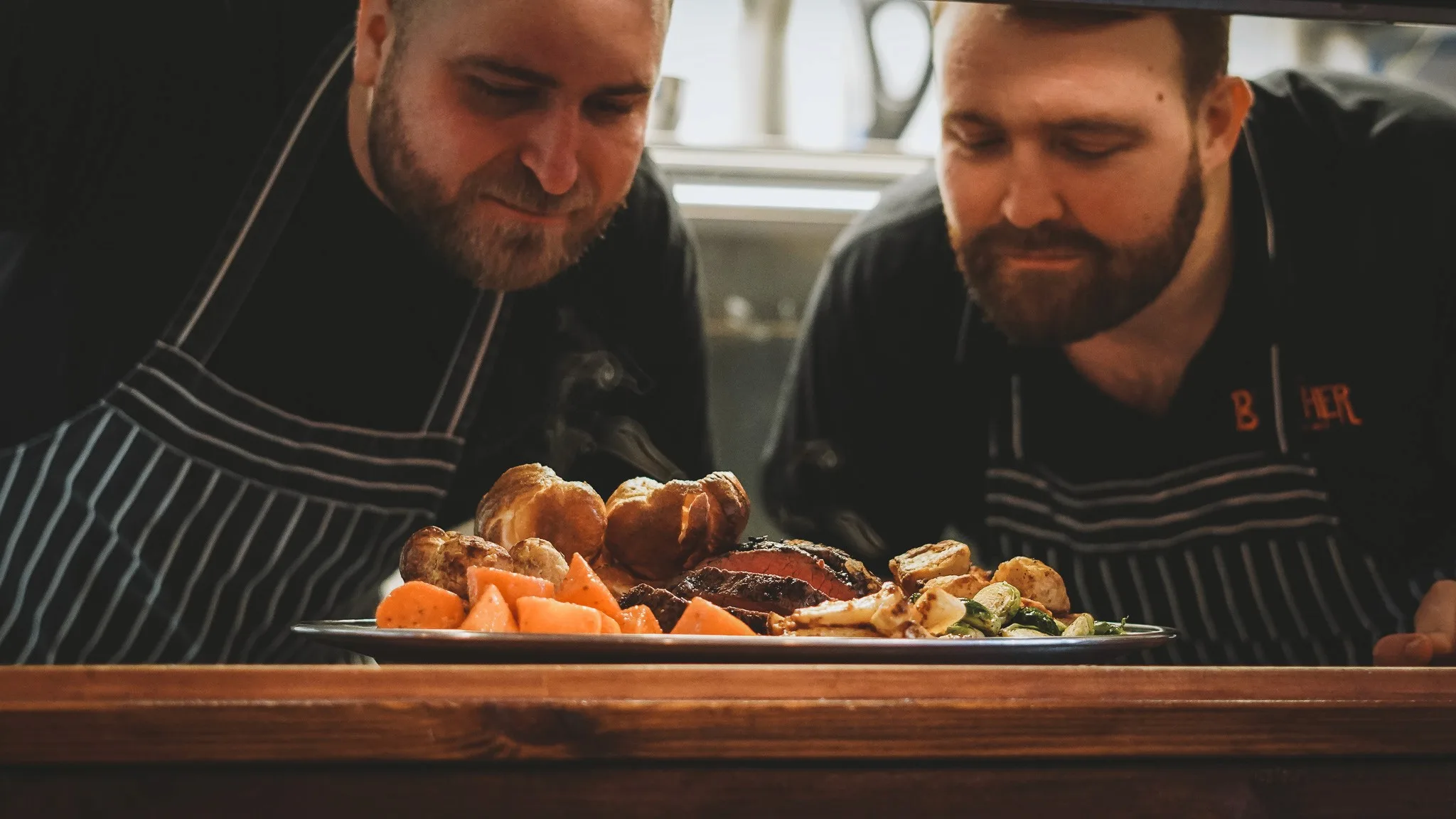
Bar Brother is a pub and sports bar in Amsterdam founded by two expats, Dave and Liam, who started slinging British roasts from a food truck during lockdown. A few years later, they opened a permanent space and needed a rebrand to match.
The challenge
Their challenge was transitioning from scrappy delivery service to brick-and-mortar destination without losing the personality their customers loved.
The identity
I worked with the pair to refresh the identity, and the result was a big, bold brand that carried the heart of the original into the new space:
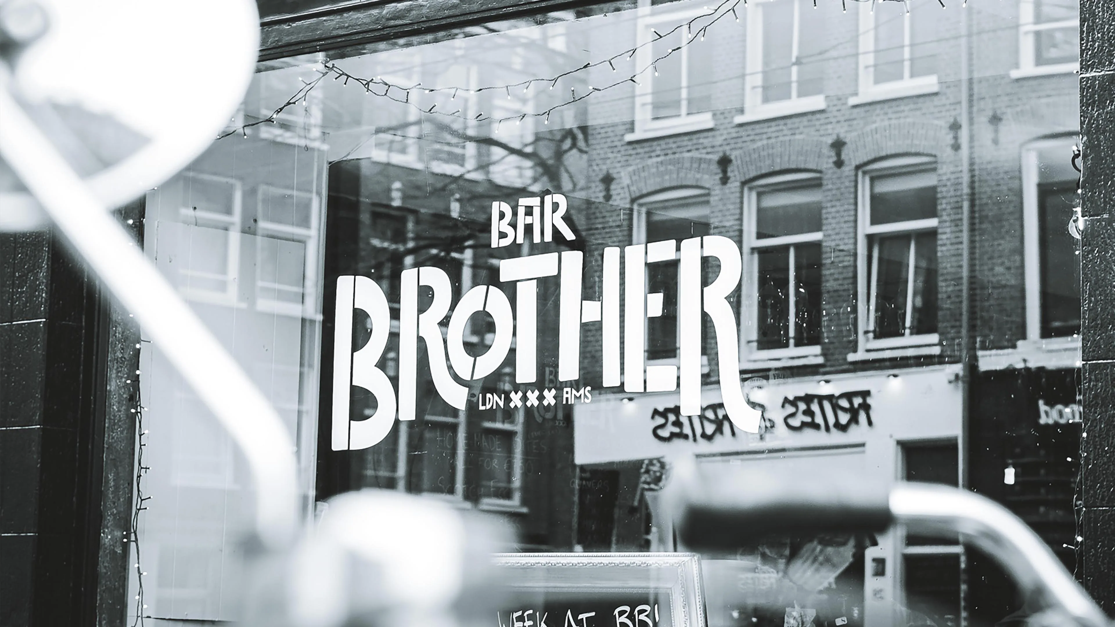
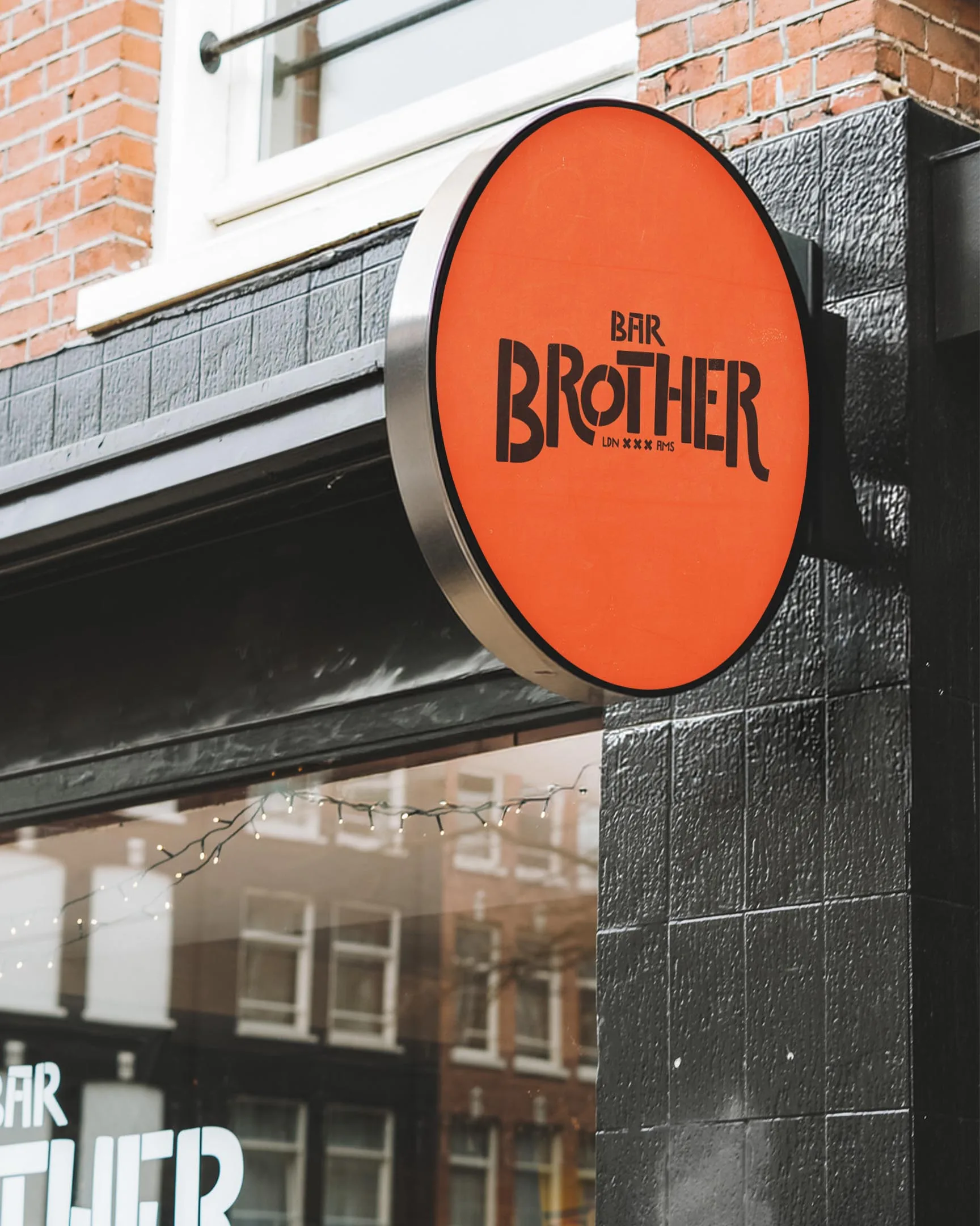
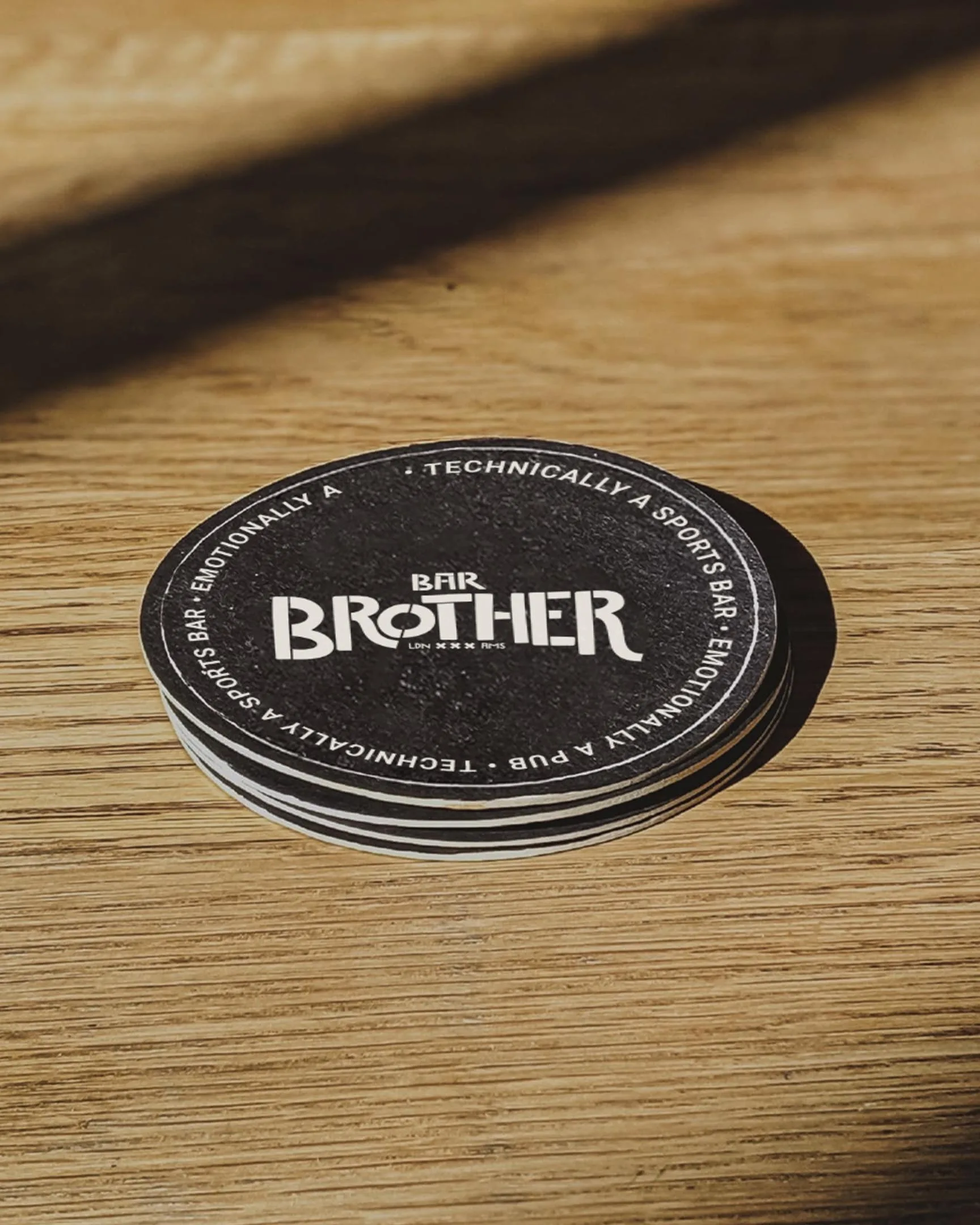
- Wordmark: a loud, characterful logotype that holds its own on a shopfront or a beer mat.
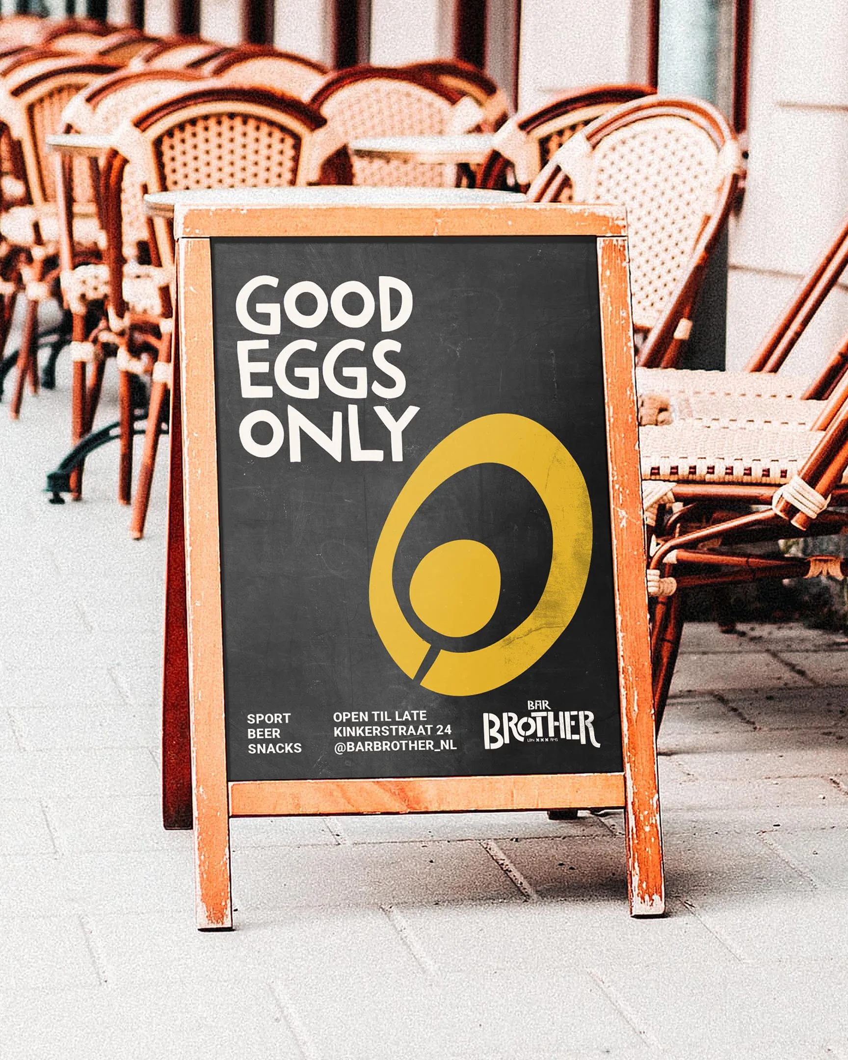
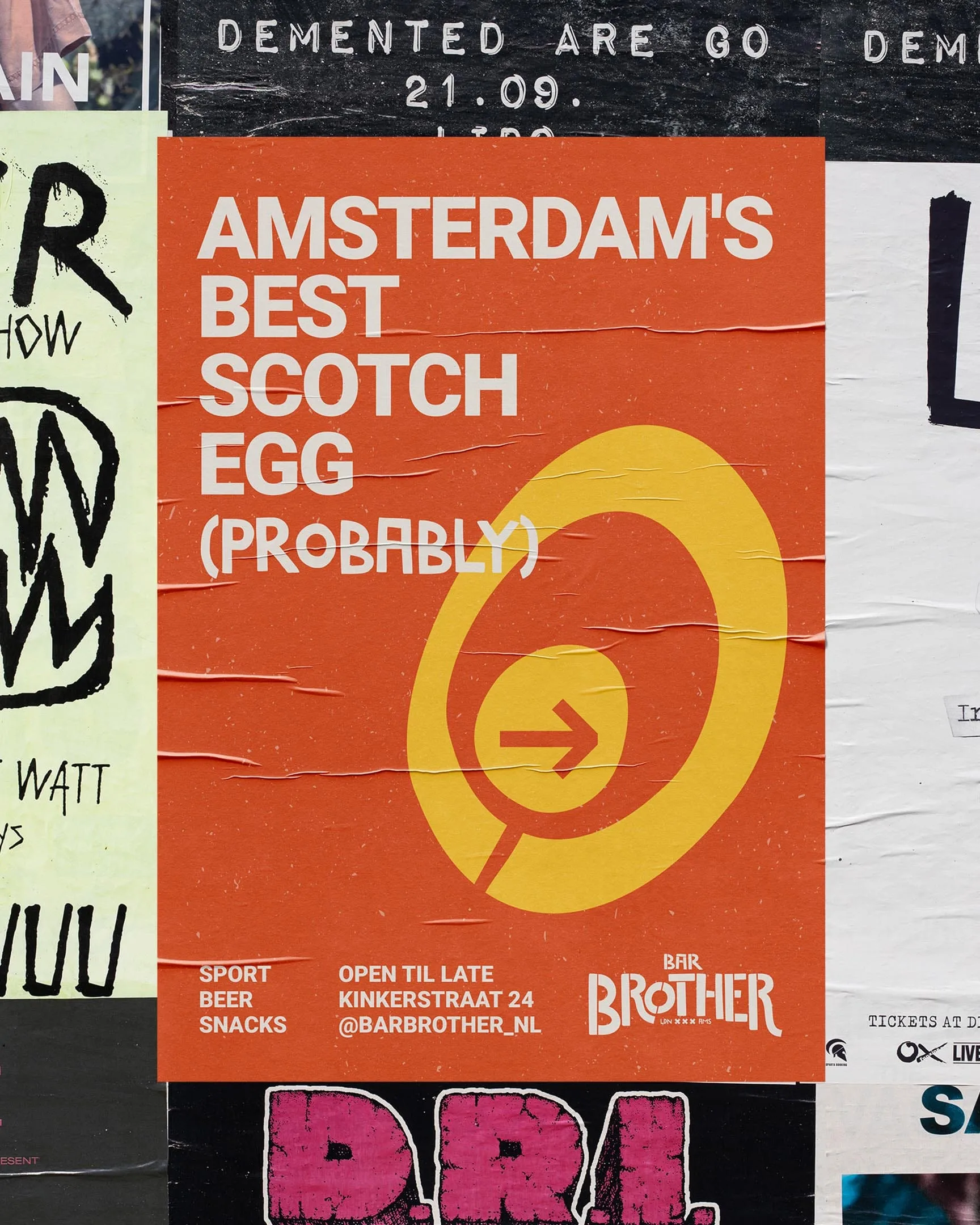
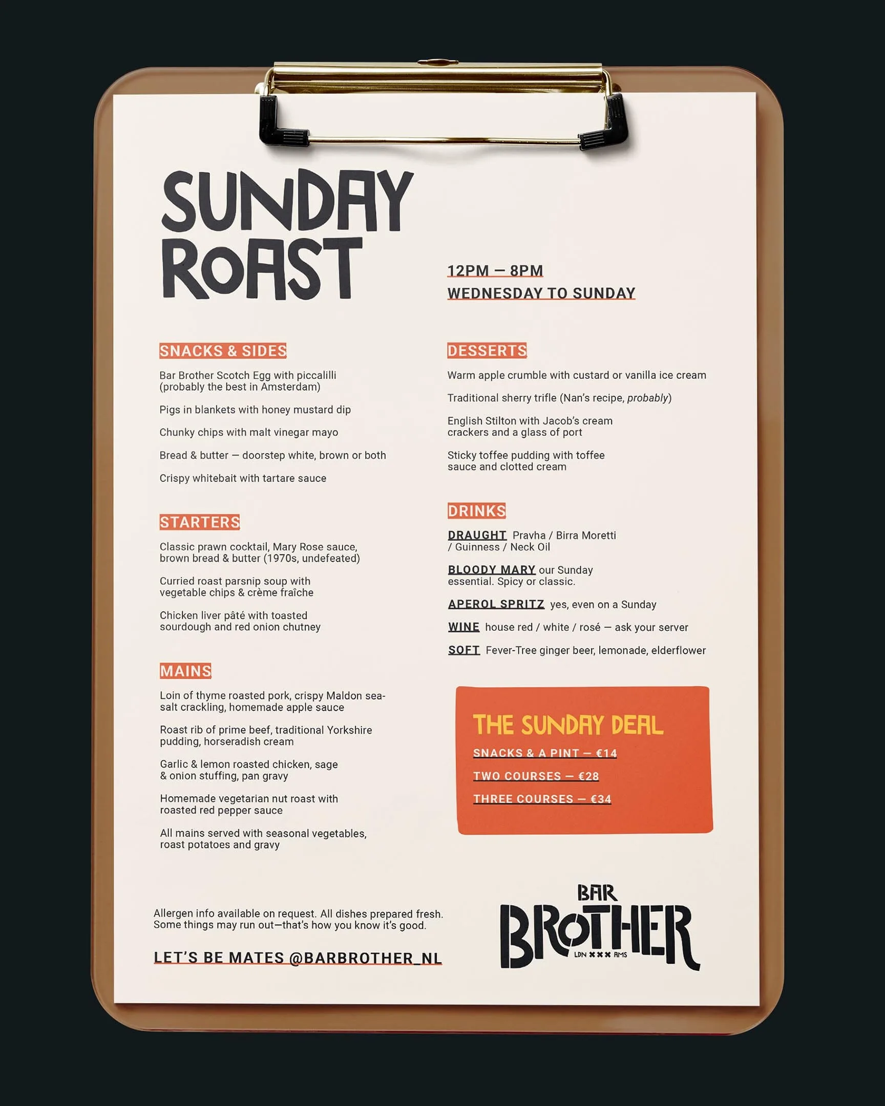
- Colour: pub orange, black and egg-yolk yellow, with an egg symbol nodding to their Scotch eggs.
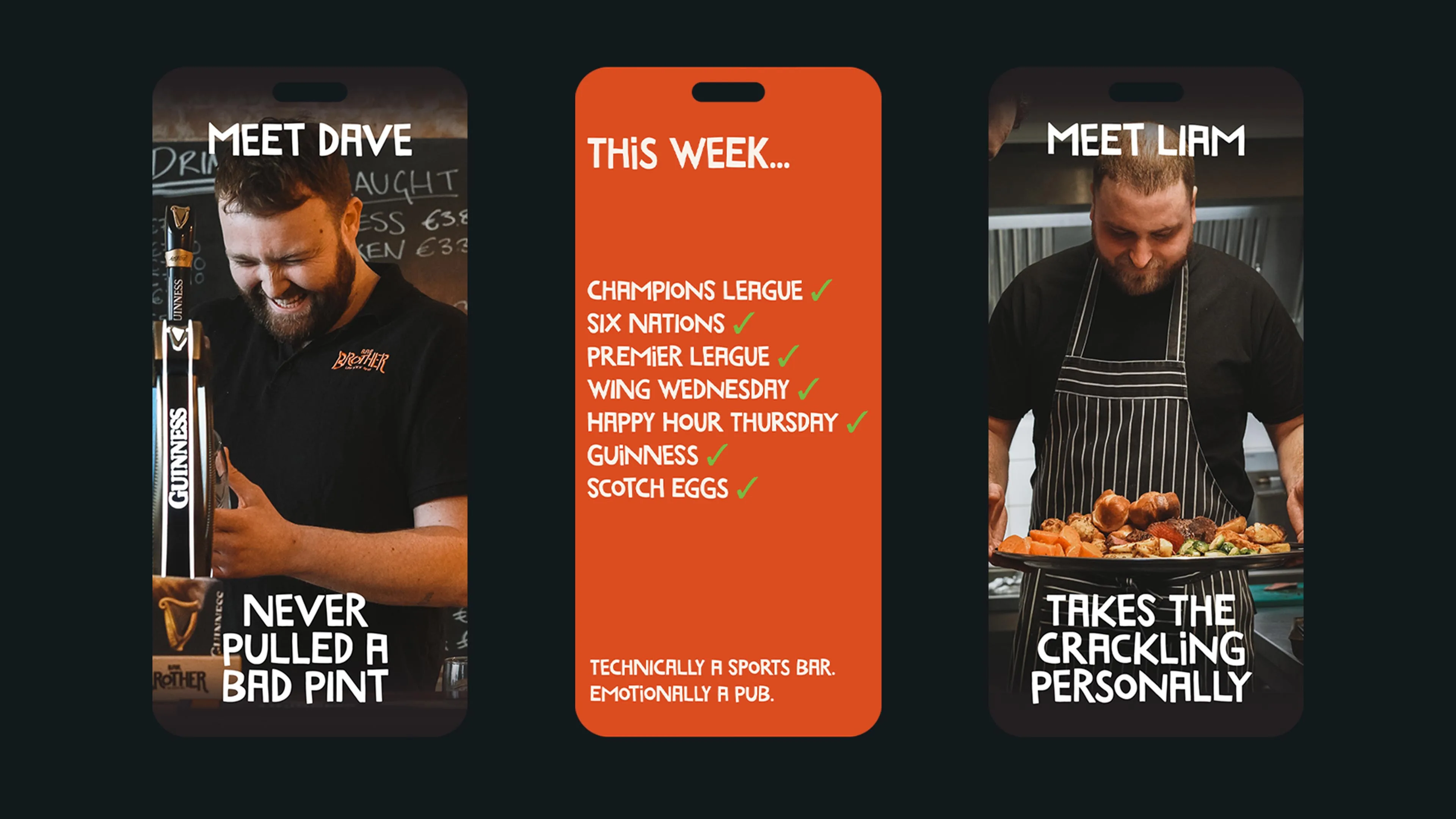
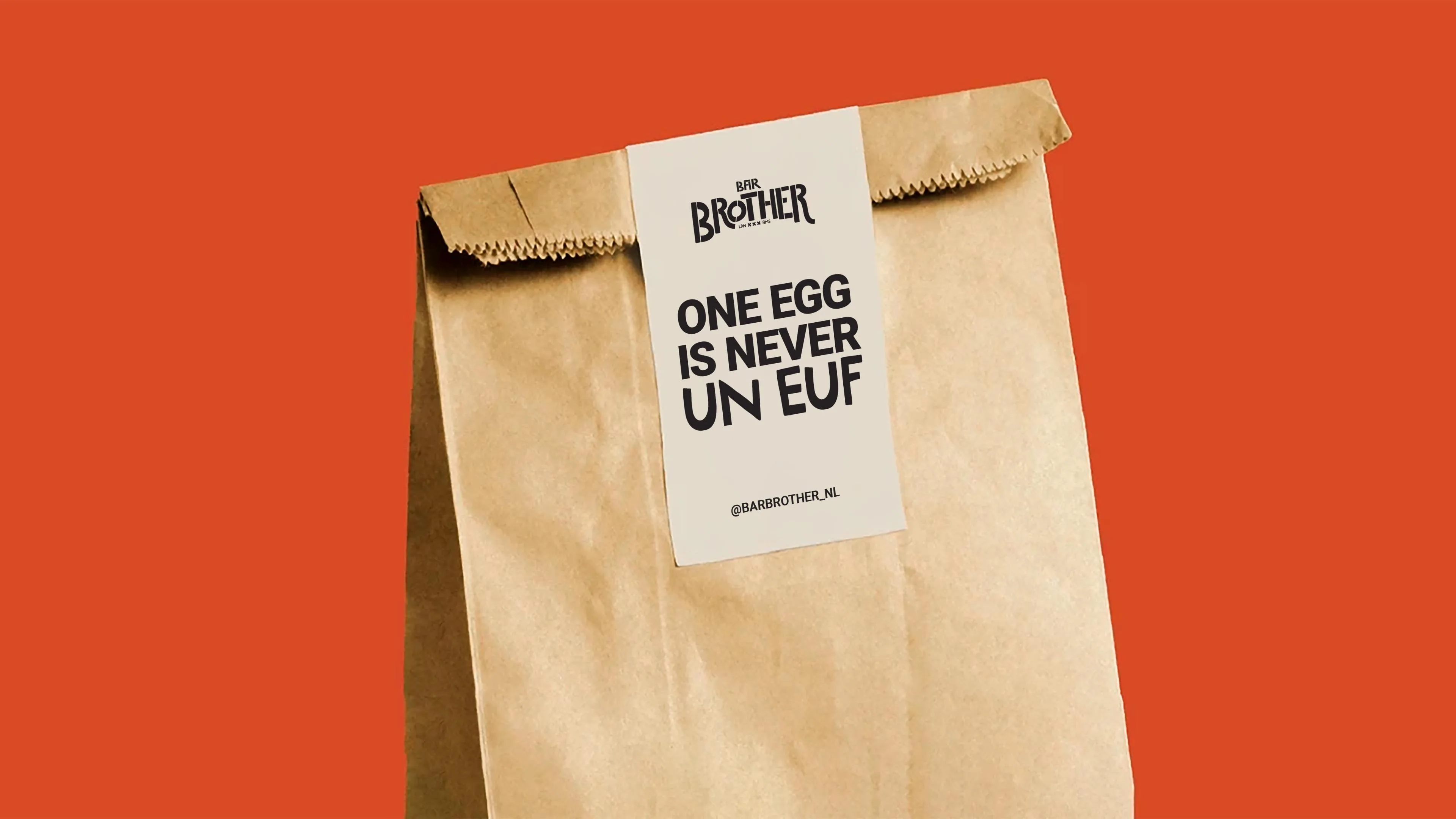
- Voice: British pub humour, from “Good eggs only” and “Amsterdam’s best Scotch egg (probably)” to “One egg is never un euf”, and the line that sums it all up: “Technically a sports bar, emotionally a pub.”
Rolled out across
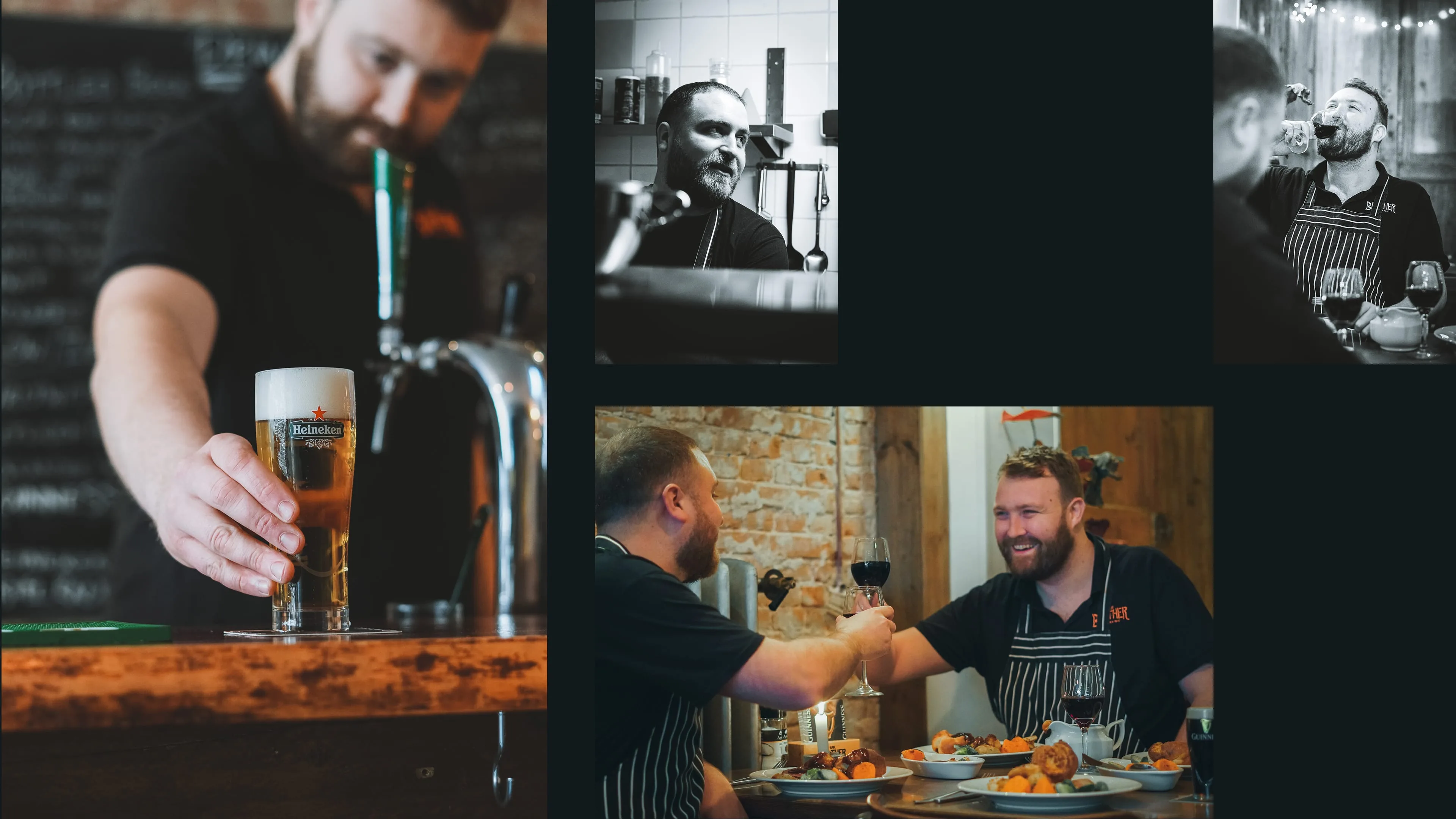
Window graphics and a projecting sign, A-boards, street posters, beer mats, takeaway bags, Sunday roast menus, and social content introducing the founders (“Meet Dave”, “Meet Liam”) and the week’s fixtures. Photography by Emiel Unknown.
The result
Technically a sports bar, emotionally a pub: Bar Brother became a go-to spot for homesick Brits and a distinctive experience for locals.
“We had to go from food truck to a pub people would cross Amsterdam for, without losing what made us us. Ben made that look easy.”